Guroom
Services
creative direction // brand identity // packaging design
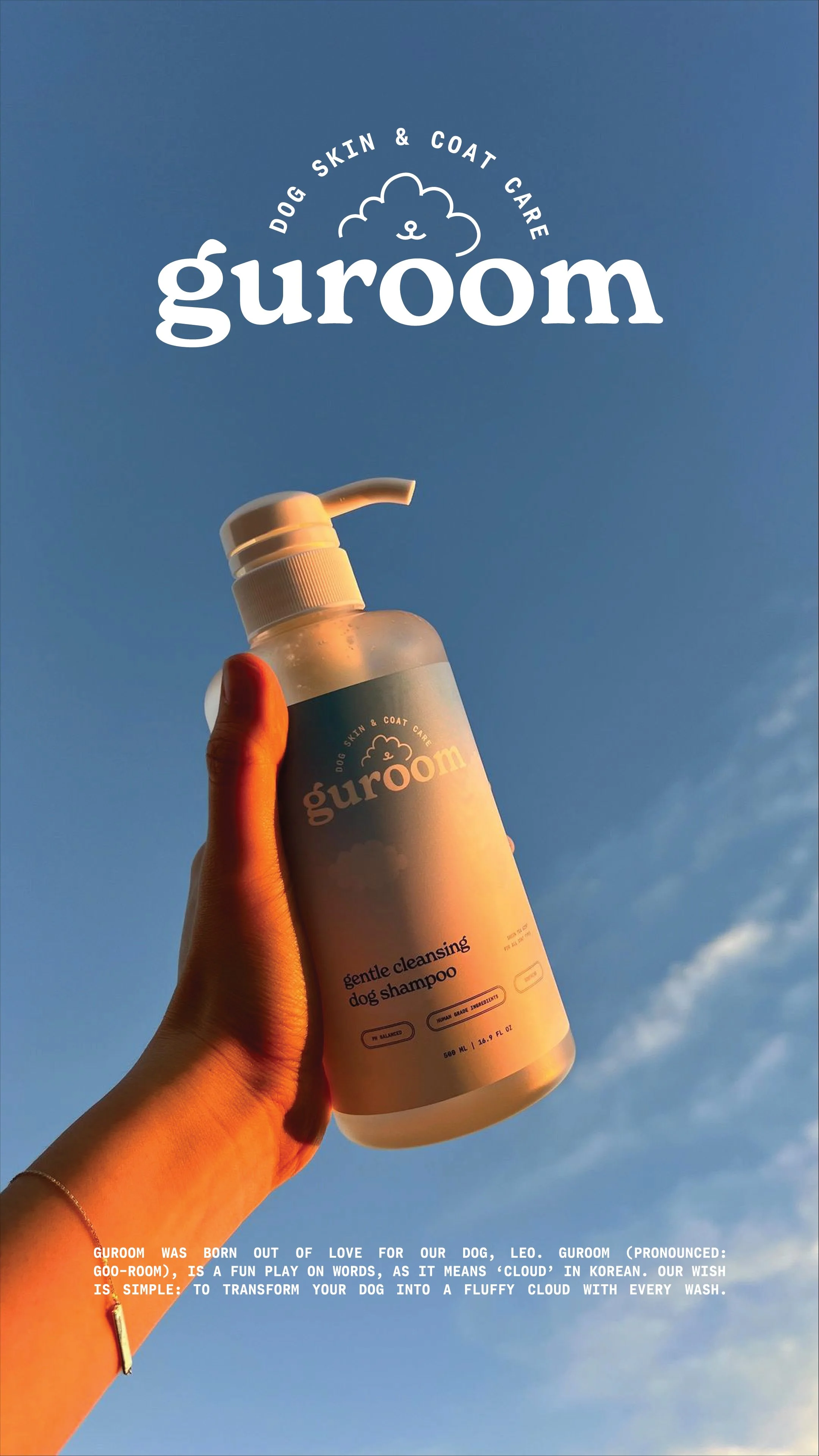
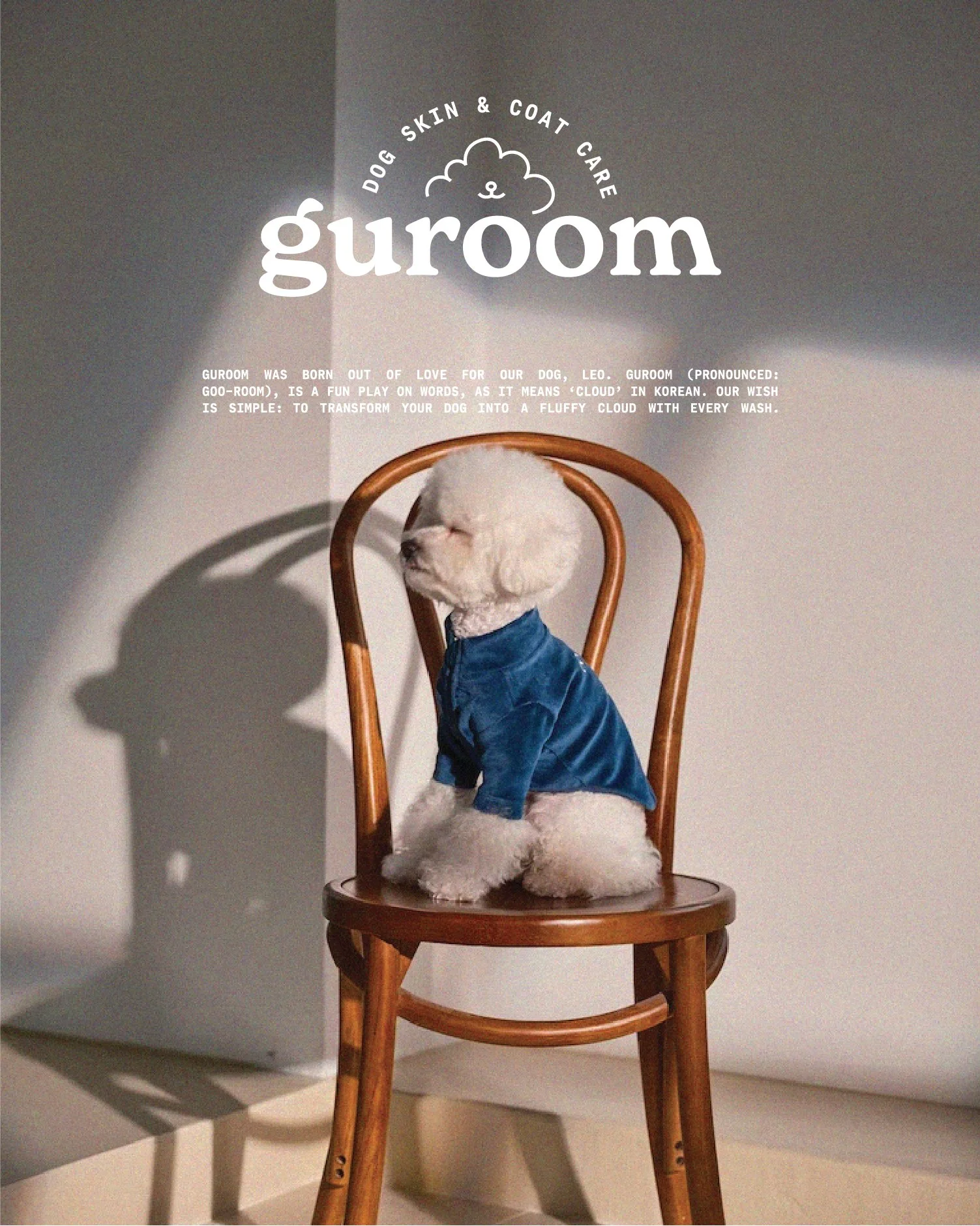
introducing guroom
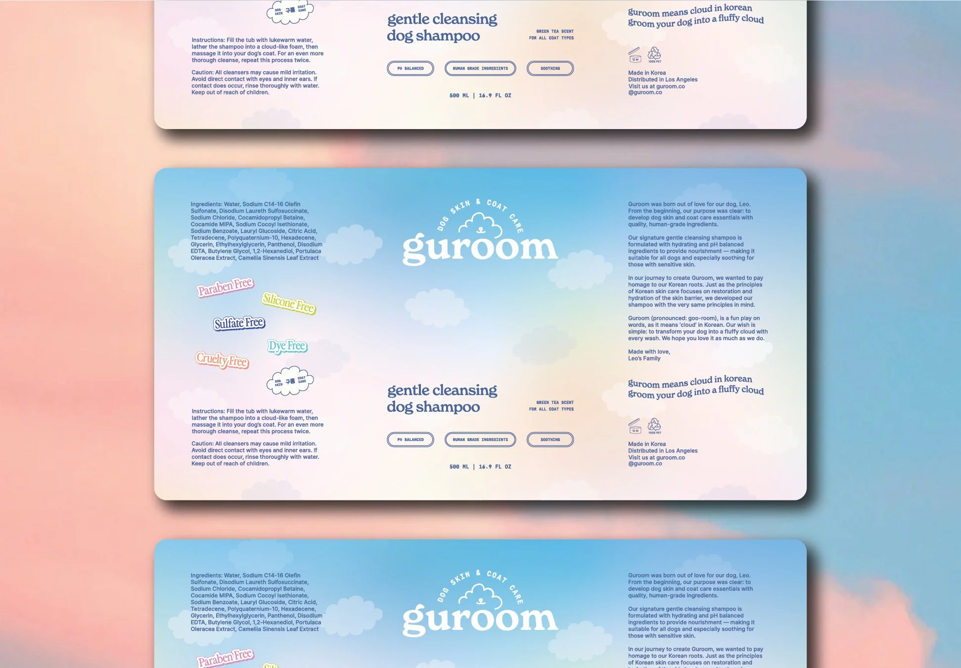
Guroom is a dog skin and coat care essentials brand born out of love, intention, and a deep personal journey. Inspired by their dog Leo’s early health struggles, the founders — a husband and wife duo based in Los Angeles — set out to create a shampoo they could trust just as much for themselves as for their pup. The result is Guroom: a gentle, high-quality, thoughtfully crafted line of dog care products designed with clean ingredients, Korean heritage, and fluffy cloud dreams in mind. Even the name “Guroom” (구름), meaning “cloud” in Korean, reflects their vision of grooming every pet into a fluffy cloud of love.
The Challenge & Solution
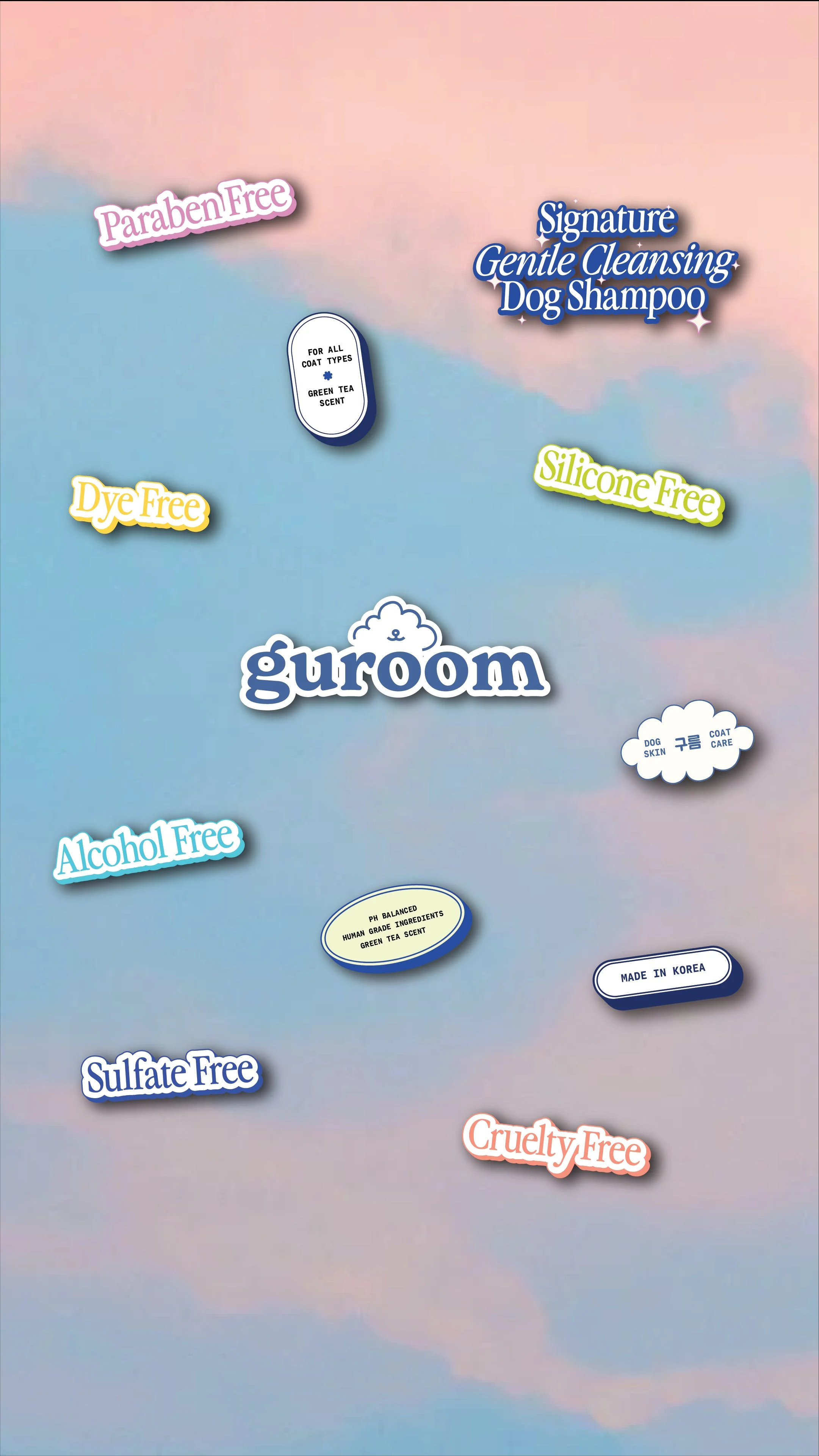
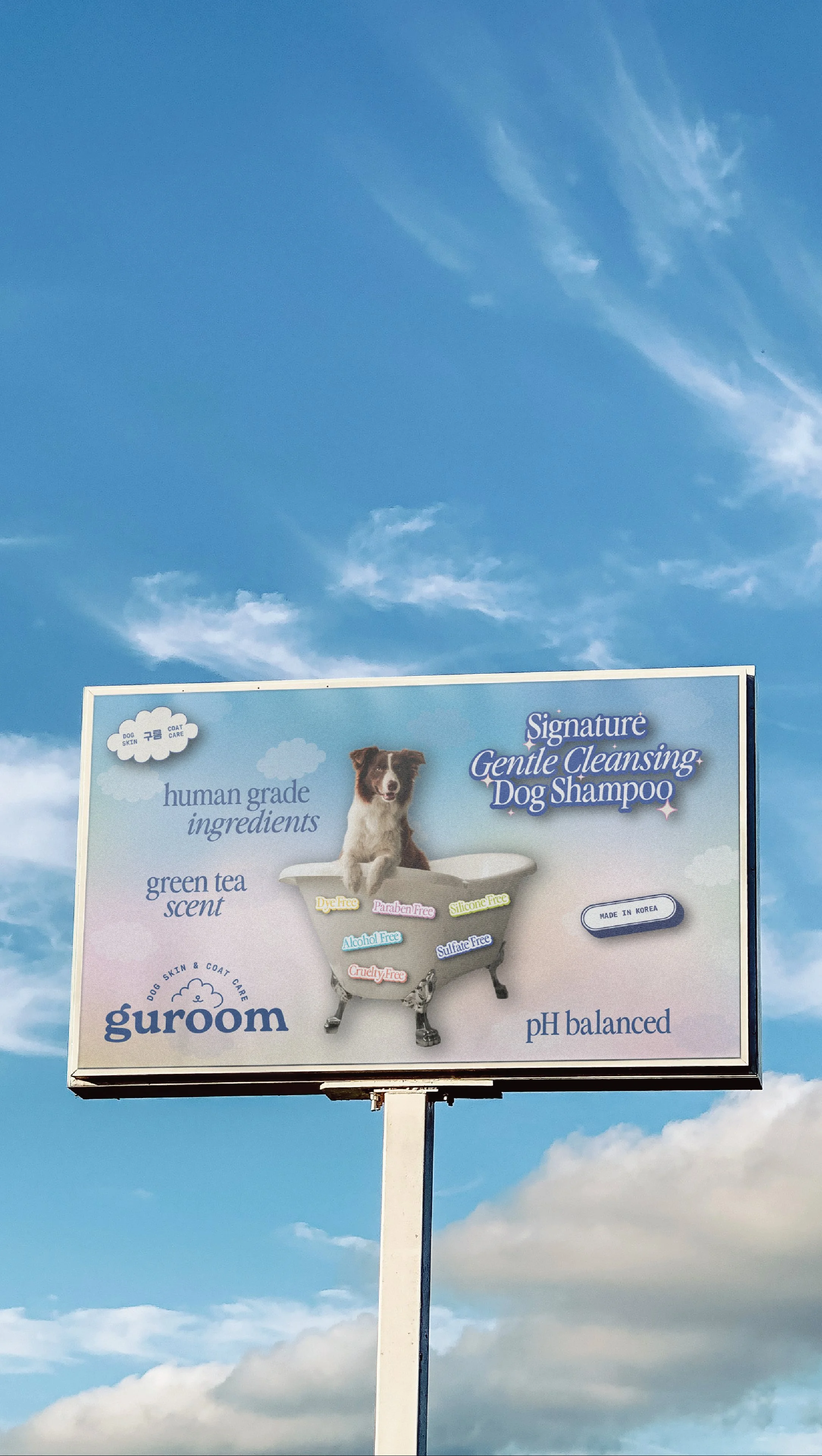
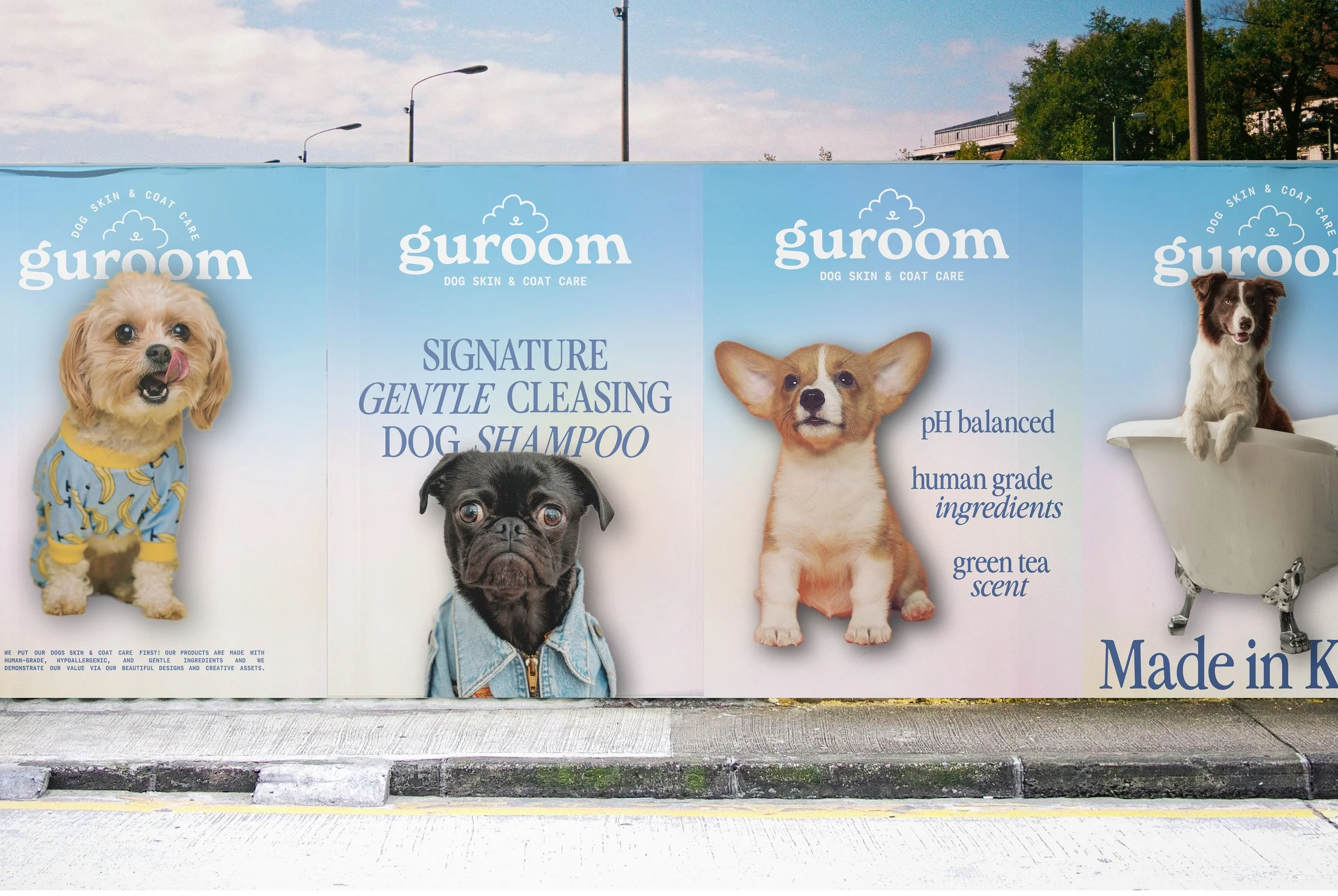
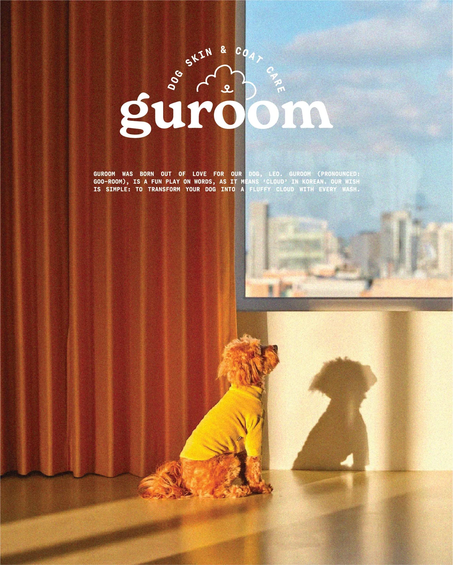
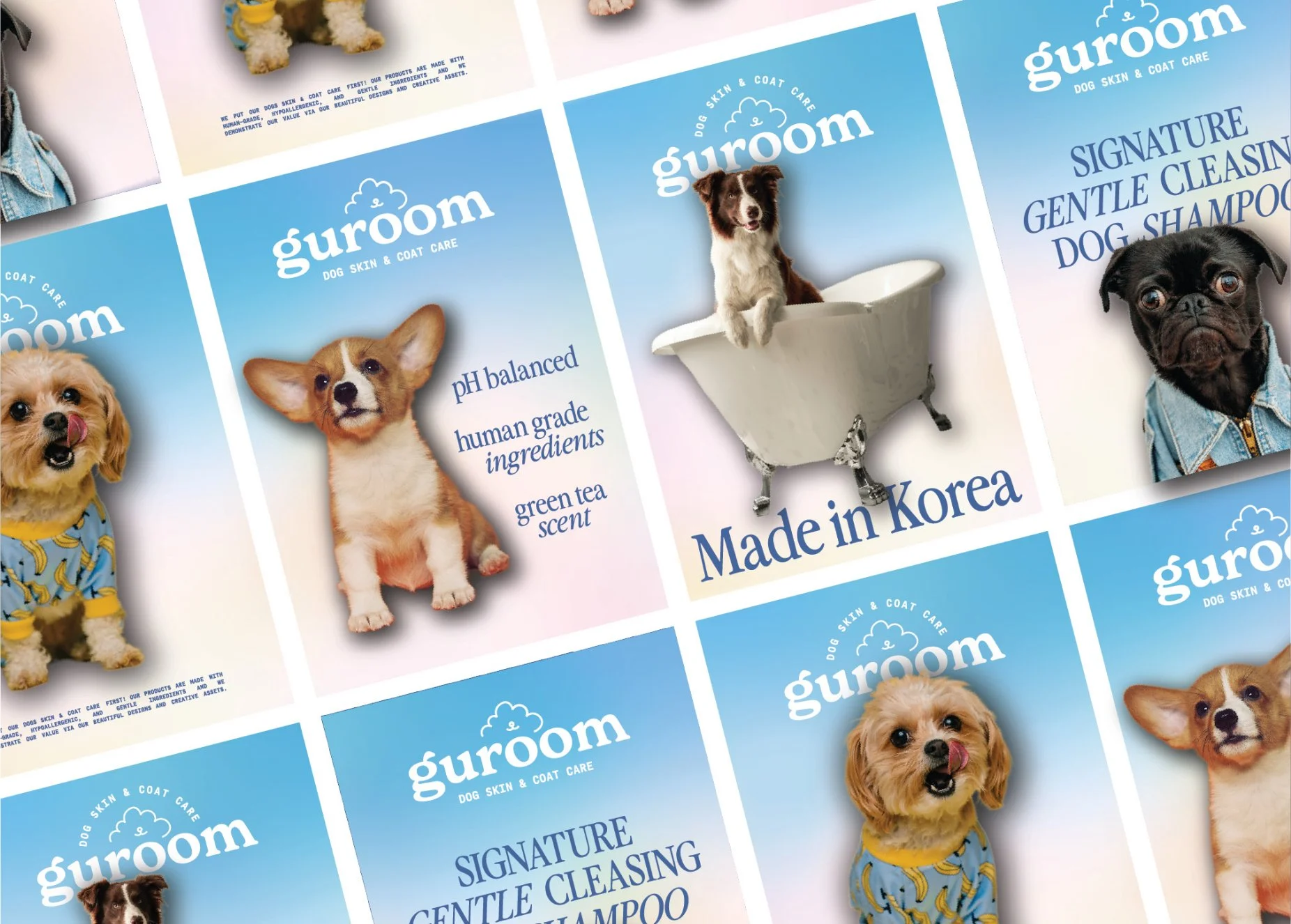
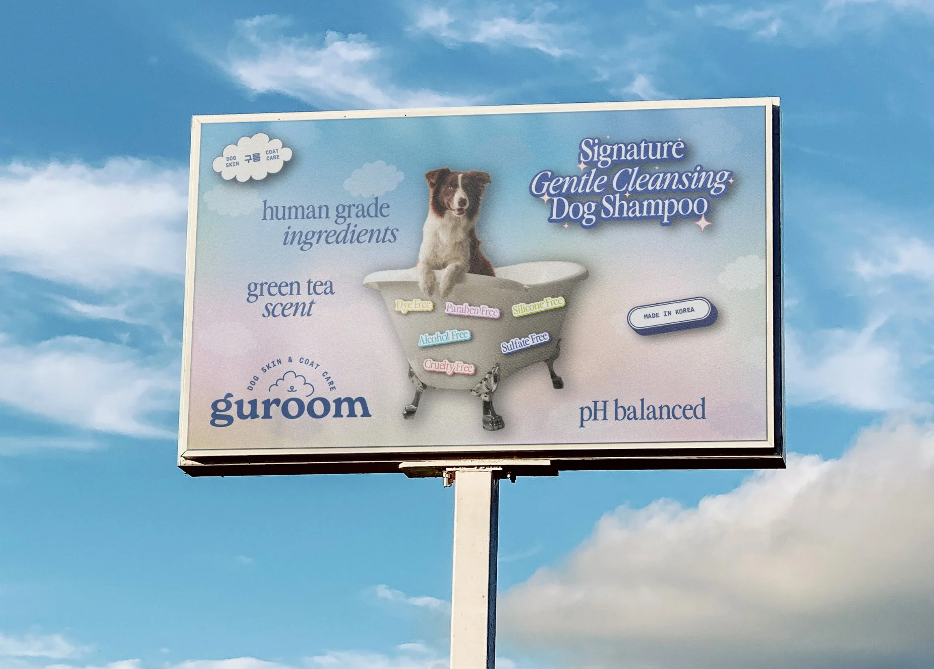
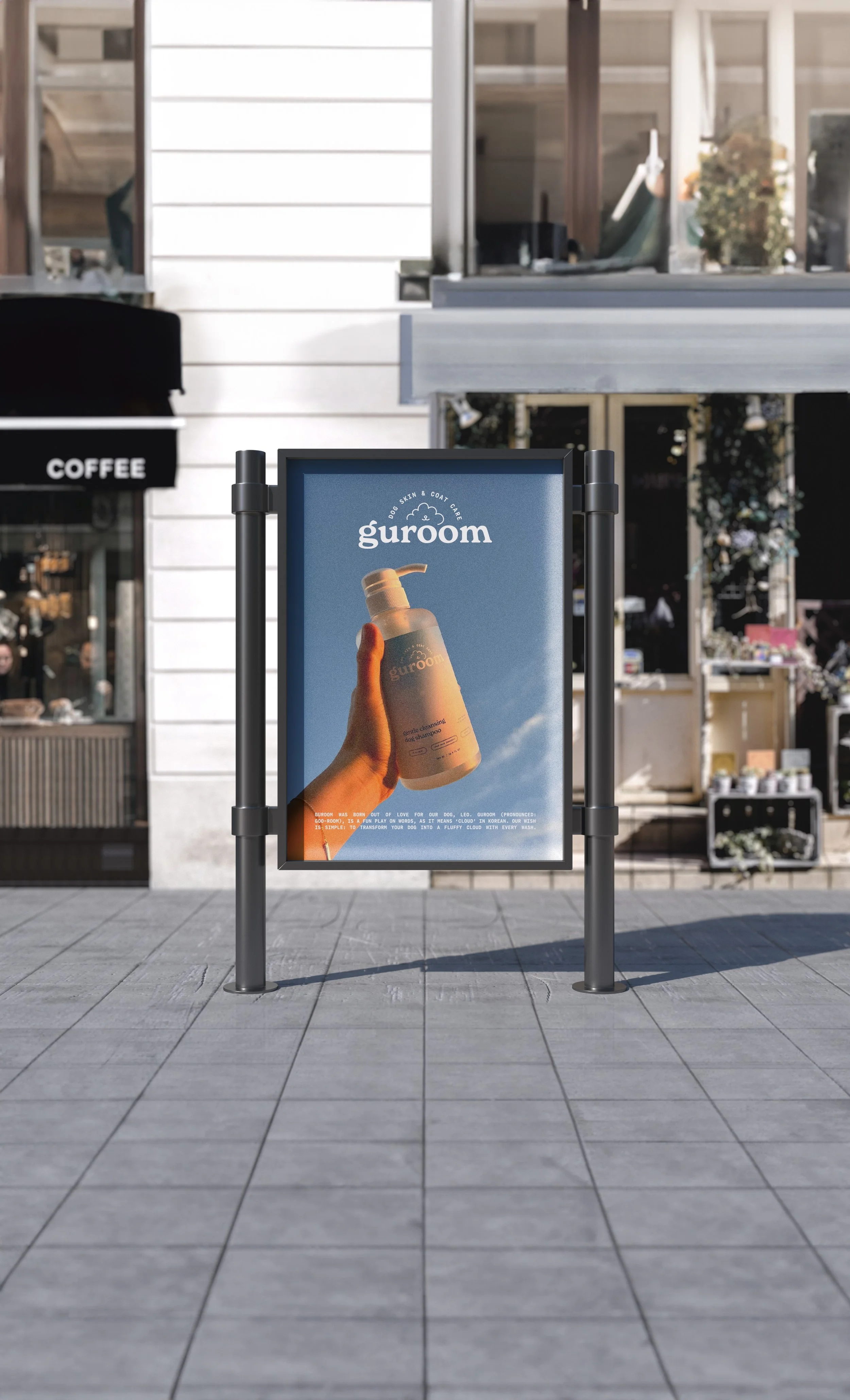
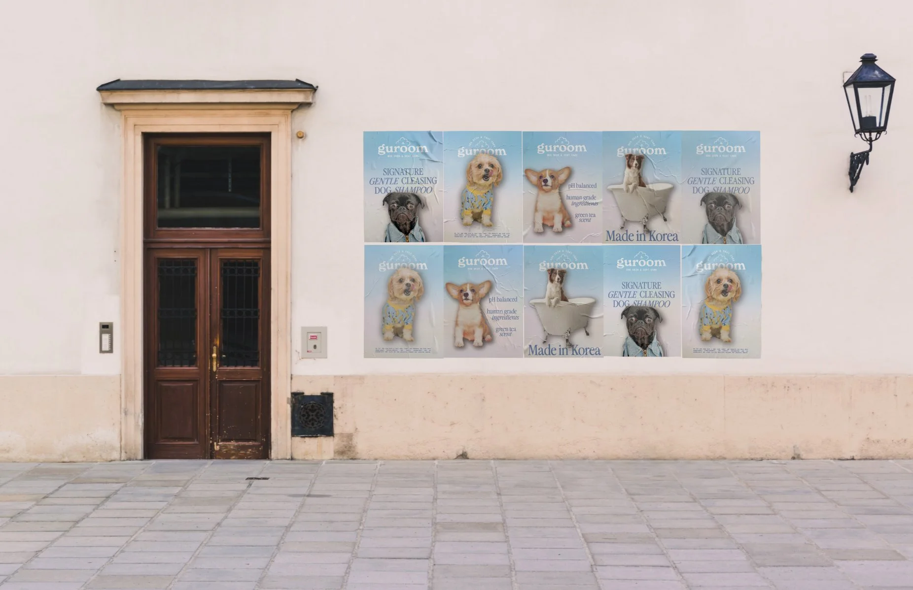
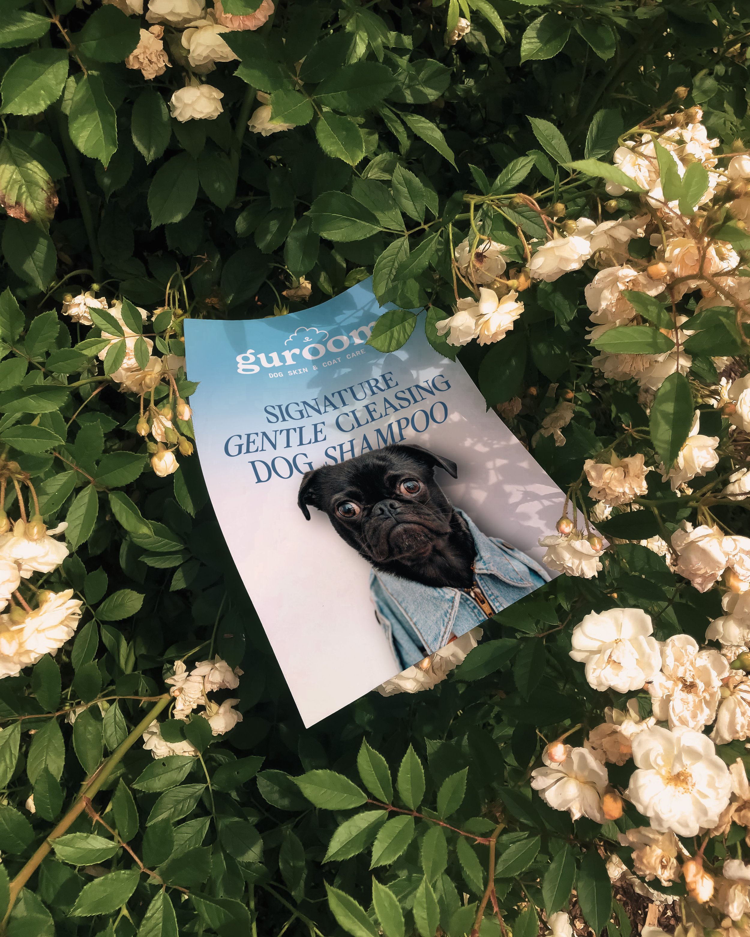
From the start, we knew Guroom had to feel as special and heartfelt as the story behind it. This wasn’t just another dog shampoo — it was a brand built out of love, intention, and a desire to give pets the same care we’d want for ourselves. So the visual identity needed to reflect that: soft, joyful, a little dreamy, and thoughtfully elevated — with just the right balance of playful and premium.
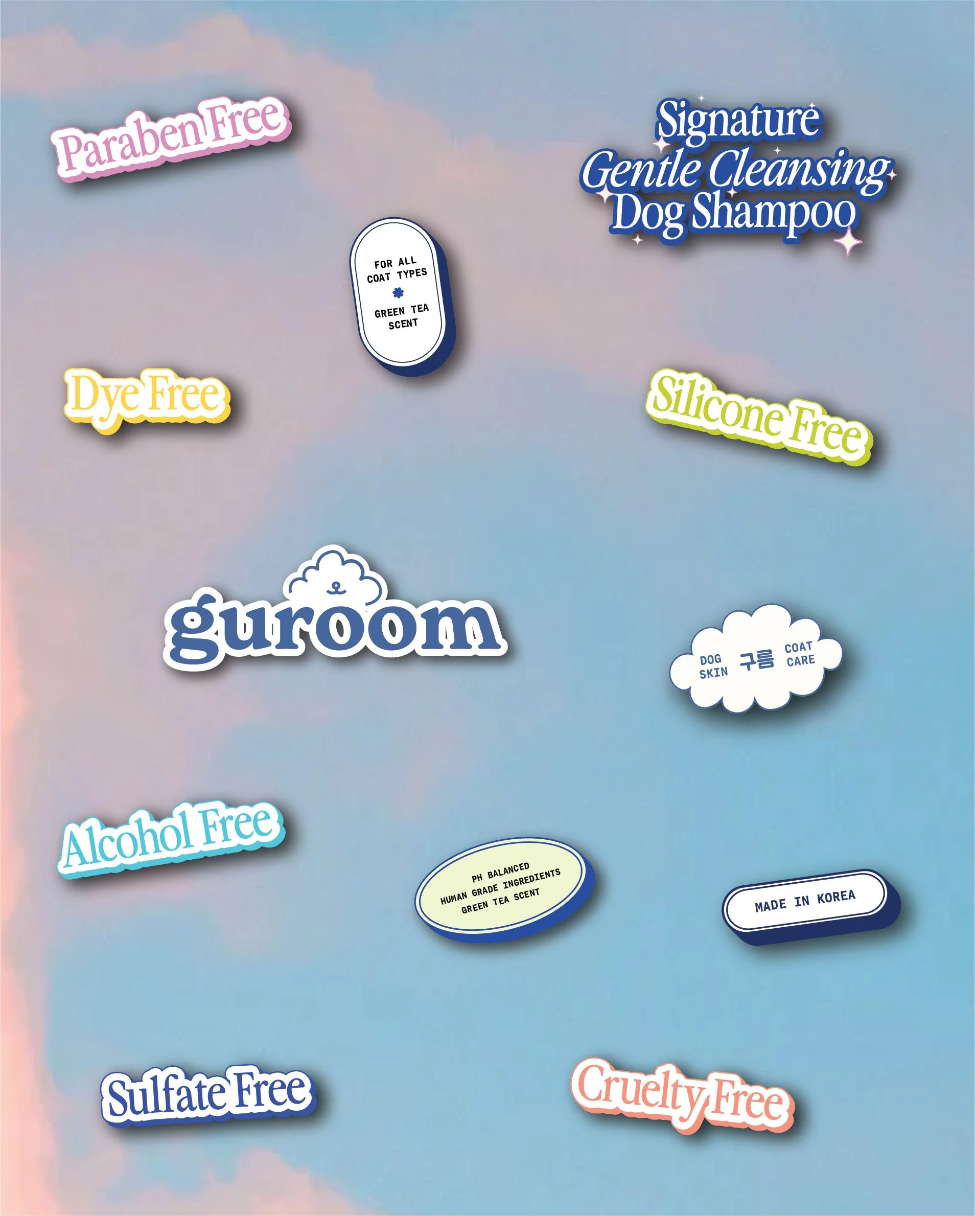
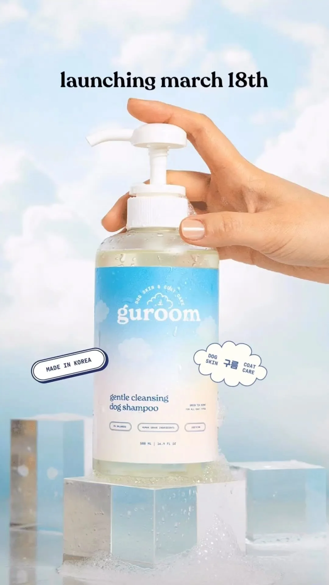
We approached this by developing a logo that seamlessly blends meaning with charm: a minimalist cloud illustration that subtly includes a dog’s nose and mouth — uniting Guroom’s name, its Korean meaning, and its core product all in one. For the color palette, we leaned into soft pastel blues, pinks, peaches, and yellows to mimic the colors of a dreamy sky, evoking both calm and joy.
We also infused a touch of Y2K nostalgia to appeal to a younger audience — not in an over-the-top way, but just enough to make the brand feel current, fun, and scroll-stopping. Every design decision, from the typography to the packaging layout, was made to reflect Guroom’s heart: a small family-run business with a big dream and a whole lot of love for dogs.